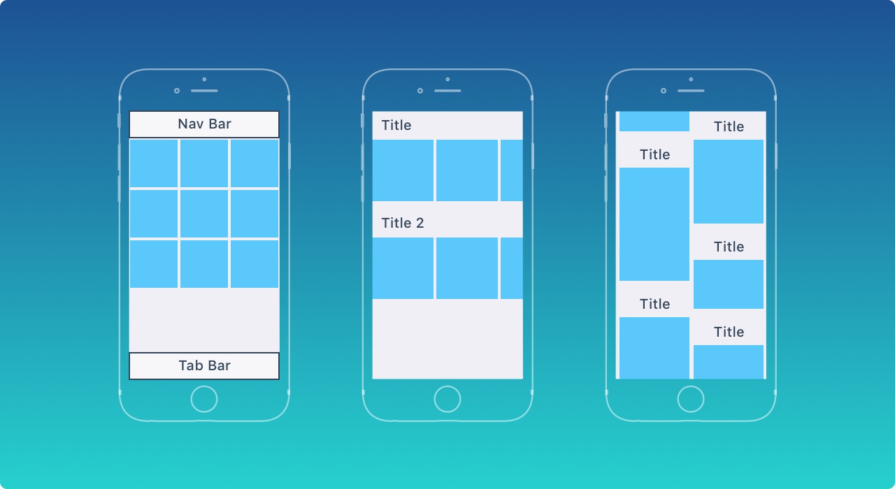
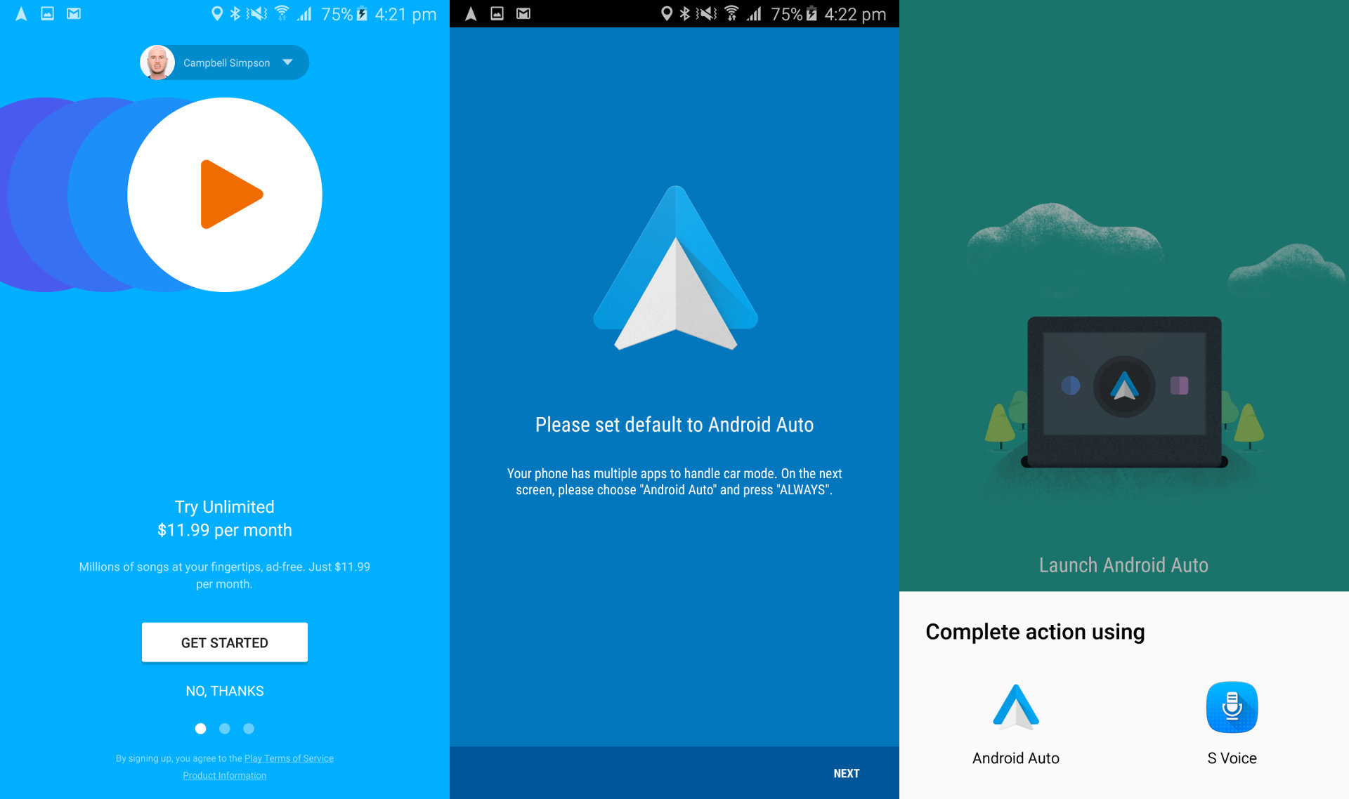
Mobile application market keeps in an explosive growth rate with the arrival of the 4G network era. Which drives the rapid development of mobile app screen design. Meanwhile, the big market also has a great job prospect for designers. How to make their own products stand out in the mobile application market is the opportunity and as well as challenges for UI designers. In addition to the function itself to attract users, the APP interface design also occupies a large part of the factors.
Facing with the serious homogeneity on mobile app screen design and low competitiveness and other issues in the current mobile application market, how the app interface design trend will develop in the future to jump out of the cycle and find new opportunities? Fundamentally, the following points are worth considering:
UI design principles
Mobile interaction design rules
How to judge an APP is good or not
UI Design Principles

1. Consistency principle. The consistency principle of mobile phone APP is the visual structure, visual level, visual elements to achieve a unified design. That can help to reduce the user cognitive costs and deepen the impression of the product.
2. Be consistent with the design guidelines for mobile phone systems. A lot of interface design books have emphasized the consistency of the interface design principles. UI designers should also follow the Dos and Don'ts for iOS App UI Design and Android App UI design guide to ensure that the design conforms to the consistency of the operating system. For example, in the IOS System Human Machine Interaction Guide, it is noted that the default font for all IOS system versions is Helvetica Neue.
3. Keep the consistent on the visual structure. Usually, the APP visual structure mainly includes the status bar, navigation bar, main menu, and content area. The main menu usually appeared in the top of the interface, so we must follow this principle to put it at the top. The layout of the other pages keeps a good coordinate to arrange the other components in a proper proportion.
Mobile Interaction Design Rules

Interaction design rules also apply to the small screens. Before proceeding with the design, designers should take into account the following five major design elements:
1. Goal-driven Design. This allows you to customize the app working process and meet requirements for target users.
2. Usability. The usability principle is emphasized in many design books. It may look empty, but you have to guarantee your application is usable and will bring value to users.
3. Affordance & Signifiers. The signifier is an implication of affordance. With correct signifier, users can easily understand UI element. For example, underlined blue text reminds you it’s a hyperlink, and it can link to other pages when you click it.
4. Learn-ability. Users can instinctively know the function of this mobile app screen design, rather than through complex reasoning to clear the logic of each button, each jump between the pages of logic. Compliance with the instinctive design is the easiest to learn.
3. Feedback and response time.
One of the standards to judge an APP is good or not is from the visual effect. A good mobile app screen design will usually impressive users at the first sight. So the visual effect on the retention of users played a crucial role. As for how to conquer the user on functions, and how to judge the APP is good or not, you can refer to the 14 questions of Julie Zhuo to the product manager.
Comments
Post a Comment