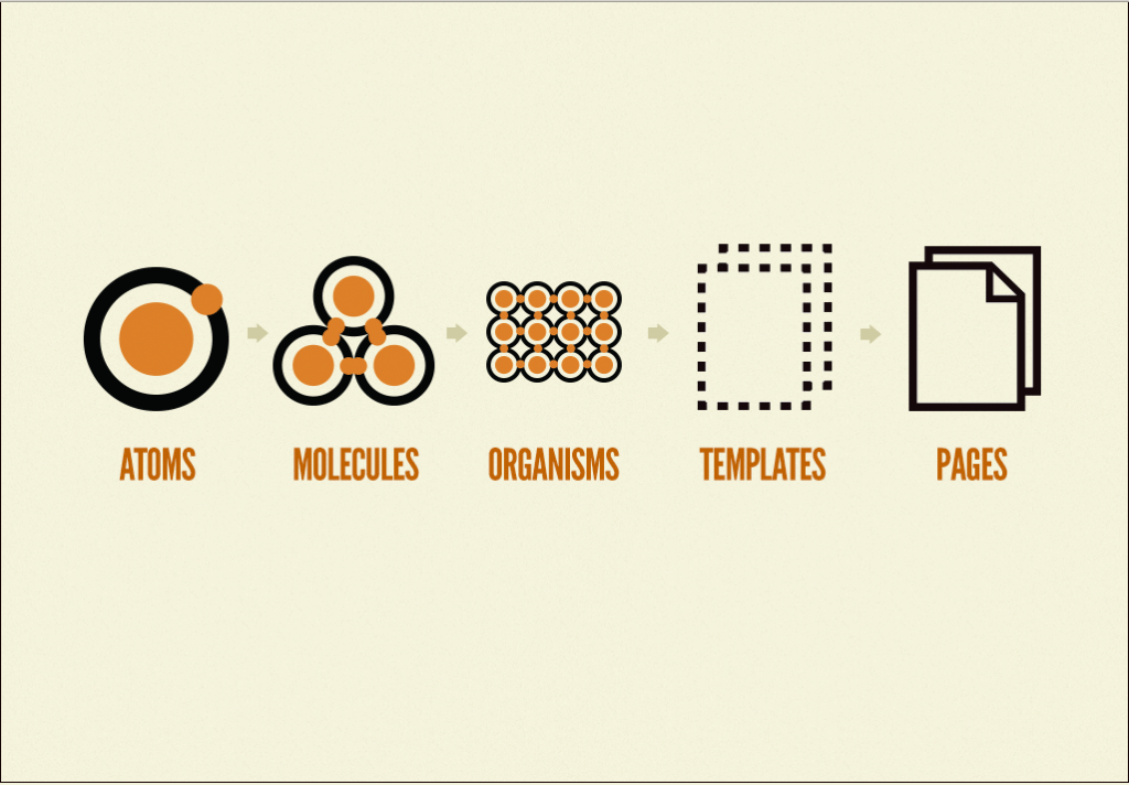
Atomic Design is an efficient method for the iterative development of extensive websites. The design approach introduced by Brad Frost in 2013 is similar to the agile development of the web site. The basis of it is modular, dynamic design systems composed of the five layers "atoms", "molecules", "organisms", "templates" and "pages".
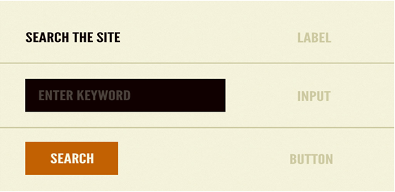
Atoms, including labels, input fields, and buttons - are the basic building blocks that designers need when they create pages. All stakeholders involved in project progress can logically follow the process. This technical, code-focused development approach places particular emphasis on the subject of user experience.
Atoms can include more abstract elements such as palettes, fonts, and even more intangible parts of the interface, such as animations. As the atoms of nature are quite abstract, the individual atom is not so useful, while they are very suitable for reference in the context of a schema library, so you can easily see the global style of the show.
Molecules - When the atoms start to be combined together, things will become more interesting and real. A molecule is composed of a group of atoms, the smallest basic unit of complex elements. These molecules have their own functional properties and form the backbone of our design system.
For example, a form tag, an input box, or a button alone can not complete a user function, but when they are grouped together to form a menu, they can now complete a task such as a search.
Organization - Molecules are interface blocks that we need to deal with to realize local functions. Then we can combine these molecules to form the organization. The organization is a relatively complex, independent interface function block formed by the combination of a group of molecules.
DON'TS
Static workflows
Often agencies transfer print-based workflows to the development of websites. Static media such as books or posters require static grid and pattern – but the permanent interaction between medium and user in digital, interactive formats requires sophisticated action-reaction loops.
Surrender to the pressure exerted by customers
In the Atomic design approach, digital designers work holistically from the small to the large. A final layout is finished therefore relatively late. Therefore, customers lacking of capability in abstraction should not force him to present a finished design.
Sameness
Outstanding front-end frameworks such as Bootstrap or Foundation are the reason why websites are very similar to each other. Even the smallest elements (eg. Microinteraction) should be branded specifically , otherwise, Websites may have semblable appearances.
DO’S
Use Atomic Design in complex projects
The more extensive a web project is, the more useful it is to work according to the Atomic design principle since it requires a lot of preparation time. A one-pager is not worth the effort.
Go directly into the coding
Designers and developers should implement corrections of concept and design of stakeholders directly in the code, rather than modeling fixed wireframes and Photoshop layouts, which requires the modules to be reused at any time. Wireframes of this kind can be discussed more objectively with the customer, because one can show specifically how users perceive the architecture of information and interact with it.
Test without visual elements
The UX-Testing with "gray blocks" prevents you from negative effects of visual details. Only after the release of the coded wireframes, can it make sense to develop the layout with the atoms, molecules and organisms defined in the frontend guides. In addition, "gray blocks" prototype can be produced by some simple and quick prototyping tools.
Test early
It is recommended to check UX concepts as early as possible in the code. Positive side effect: This automatically develops a better understanding of programming limitations and challenges.
Read more:


Comments
Post a Comment