Sketches, wireframes, design drafts, high-resolution visuals: Prototypes are indispensable for the development of interactive applications. We explain the differences and say which type is suitable for which task.
In the development of digital products, no way leads to prototypes. Their goal and purpose are to create a graphical representation of ideas, functions and content to get feedback and improve the product. The most important challenge in interactive design is usually the interface: it should be user-friendly, intuitive, best self-explanatory.
The development process constantly raises questions, which must be clarified by means of prototyping: What elements does the user perceive? How does an object react to it and what is the logic behind the whole system? Is this logic easy for the user? Prototypes help to find realistic answers based on experience values, in this way making the best design decision.
But what kind of prototype is suitable for which phase of an interactive project? What makes it? Should it be as elaborated as possible or is a simple, fast execution? Are simple prototypes possibly overtaken, where you can also quickly click on interactive prototypes with the right tool? Is it the designer, the developer or the UX expert, who takes care of their production?
Testing by all means from low to high fidelity
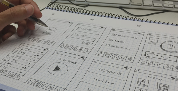
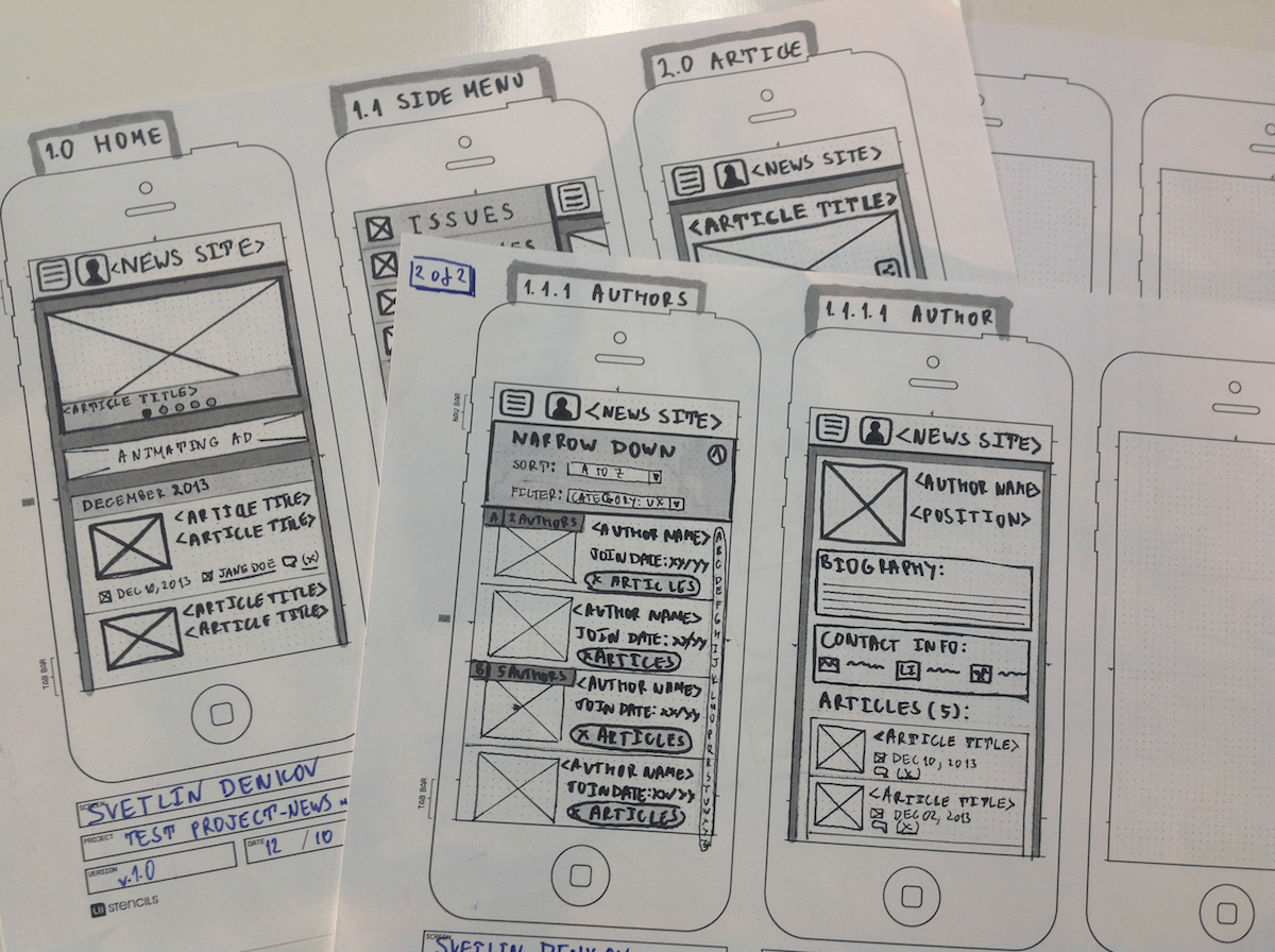
Prototypes have a different degree of fidelity in terms of appearance and functions. Sketches or scribbles are usually sufficient for the first sketches. In this category of the Low-fi prototyping also monochrome wireframes still keep rough, which are usually already digitally created, it can however already bring structure and functionalities in the focus. These schematic sketches do not have to be colorful and fancy at all, visual elements mostly remain outside, and Lorem-ipsum texts are common.
With Axure, Balsamiq, Justinmind or Mockplus, there are a few tools with a large selection of elements (buttons, links, menus and cetera) that allow you to quickly create an interface. By integrating further design elements, the wireframes can then also be refined into sophisticated click-dummies.
In the phase of Hi-fi prototyping, a project occurs as soon as mockups are made
These are detailed design drafts, in which colors, shapes, textures, distances and fonts are added. There is no technical standard for this, a mockup can be created as a PowerPoint presentation, as an HTML design (with one of the prototyping tools mentioned) or as a graphic. For example, you can use Photoshop to approach the visual design you are looking for. If website or app is animated, video dummies, for example in the animation software After Effects, demonstrate to the customer as well as the programmer specifically where the trip should go.
Team discussions and concept tests do not need bling-bling
However, the process is not so straightforward as it is in practice, since the type of prototype that is best suited depends on several factors: the target group and its technical background, the interest in knowledge, and the development phase.
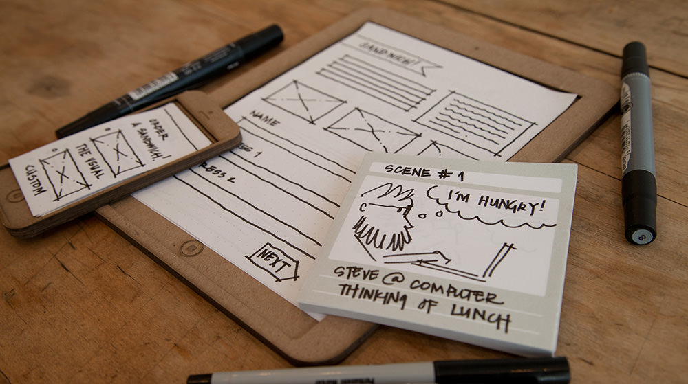
"There is nothing better than simple sketches by hand," says Miriam Scheibe, self-employed UX designer in Hamburg, "to gather ideas or to move between the concept and the developer like ping-pong.” Scribbles can also be used to display behavior and interactions by grouping several screens as flows and hanging a few sheets side by side, for example, to show what happens when the user goes through a check-out process. Since in this early phase only the concept is verified, there is no need for visual design. "The vaguer an idea is, the simpler the prototype should be", Miriam Scheibe said. And for those Scribbles are too far away from the product because they need a more specific form for early testing, they can also capture their paper templates and turn them into a simple interactive website or app prototype using a prototyping app.
Detail Internal, Eye Candy for the official
Wireframes serve internal communication in order to convey the information of architecture between design, visual design and development. Although this can be done with a rigid PDF file, many tools offer far more: instead of a lavish task that no one can read, more and more agencies are creating interactive wireframes that simulate the application's behavior. Rapid prototyping tools such as Mockplus help a lot.
Visual work is necessary wherever it is not only communicated internally and at a common professional level. "If the team has agreed in the concept phase and wants to get an OK from the head of product or department manager, the presentation form has to become more concrete," explains Miriam Scheibe. "Because these people usually do not have much time, you have to bring the idea over like an elevator pitch. In the absence of time and budget for the Photoshop design, wireframes can also be embeded by integrating backgrounds, graphics, fonts, or colors."
Even if agencies present their customers or start-ups in front of venture capital donors, it is better to rely on Hi-Fi and not rely on the abstraction ability of the audience. In such situations, fulminant aesthetics and impressive look-and-feel are still more than sophisticated functionalities and click-throughs.
Choose & use the right prototyping tools in different project phases
Low-fidelity
Function: With scribbles and coarse wireframes you can easily and quickly get feedback on new interface ideas and experiment in agile creation processes. For external tests, more concrete forms help.
Degree of elaboration: simple designs without claim
To completeness and graphical binding, which can be quickly changed and supplemented.
Tools: pen and paper, Flinto, Marvel, Proto.io
High-Fidelity
Function: Hi-Fi prototypes are detailed design drafts, interactive click-dummies with a sophisticated design and videos with graphic animations or screencasts. They are suitable to present to investors or customers - including the look and feel of the digital service or product.
Degree of elaboration: Limited to two to three important, designed pages
Tools: After Effects, Photoshop, Mockplus, Justinmind, Sketch
Programmed with specification
Function: Fully functional interactive wireframes, in which the interface elements, their arrangement and especially the screen flow are already fixed - often with a simultaneous playable Word specification. Also the behavior (animations, responsiveness et cetera) is clearly recognizable, which facilitates communication at the interface between design and development.
Degree of elaboration: All functions and elements including their arrangement are defined, only the text level is open.
Tools: Axure, UXPin, Mockplus and Justinmind
Read more:


Comments
Post a Comment