Mobiles have fundamentally changed the way we live and shaped our everyday activities. With our mobile phones, we can not only access all kinds of content but also accept credit cards, order and purchase, sign digital documents and even lock our front door. These tasks have been simplified thanks to the existence of the smartphone. Mobile phones have many advantages and limitations as well. These strengths and limitations are important aspects of designing the mobile user experience.
1.Small screen
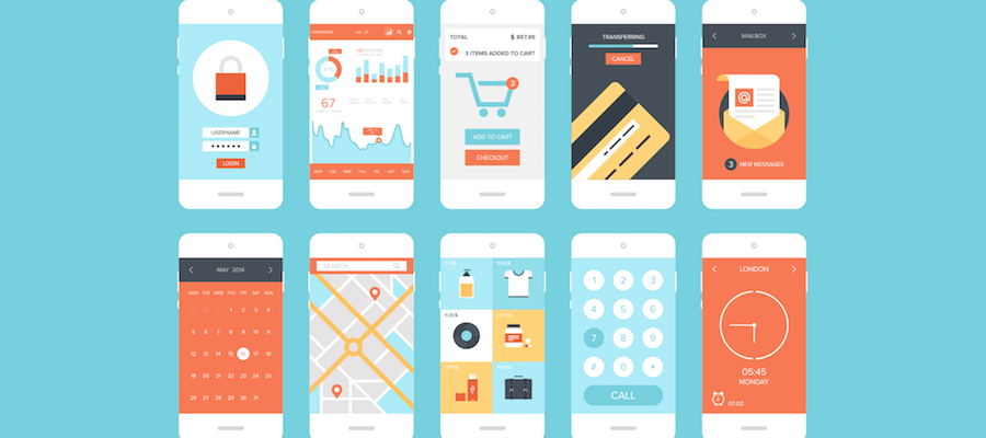
Despite the mobile UX design trend with a larger screen, it is their small size that makes mobile phones so practical and portable. Compared to desktop or laptop screens, much less space is found on mobile phone screens. Therefore, the screen size is a real limitation of mobile devices. The content displayed on a 30-inch monitor above the fold must be distributed on a small 3-inch screen on five screens. Therefore, mobile users must accept higher interaction costs to access the same information, and rely on their short-term memory to return to information that is not on the screen. It is therefore not surprising that mobile content is twice as difficult to understand.
Whenever you present a new design element or new content on a mobile screen, other things are removed (or disappear under the fold). Consider the opportunity cost of each new item: what does it mean for the user when you remove item B and insert item A? Is element A more important than element B? When designing the mobile user experience, the prioritization of content and functions is crucial.
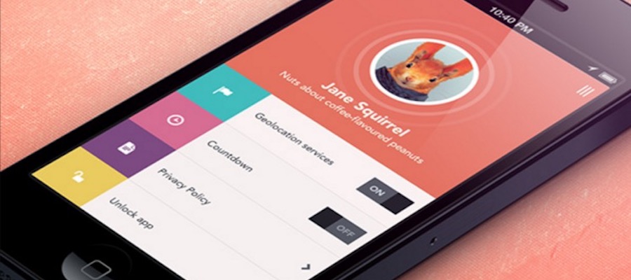
"Chrome" refers to the elements of the user interface, which are decisive for the use of a page or app. Users who come to a page to find needed information or to do a task can not be scared of the beauty of the buttons, bottom navigation or other design elements. Content should be always interesting in mobile UX design (both on the mobile phone and on the desktop). While content and Chrome can exist side by side on a desktop computer, designers on mobile devices often need to reduce the amount of Chrome to have more space for important content.
This does not mean that Chrome should disappear from mobile devices. It is very difficult to create a usable user interface without Chrome. However, the principle of designing the mobile user experience is that designers have to realize a high content-to-chrome ratio on the mobile screen.
2.Portable = Interruptible
Mobile phones are portable: most fit easily into a handbag and we can take them anywhere. Since we use mobile phones in different contexts and situations, we are more likely to be interrupted while using such devices: an external event in the outside world might require our attention and force us to interrupt our activities on the small screen. The result is that the attention on a mobile device is often fragmented and meetings on mobile devices are short.
In order to design the mobile user experience better, designers should save contexts and make it easy for the user to restore connections to continue a broken task. The mobile app or website should always save the current situation and prepare for such interruptions. In addition, it should try to make the transition back to the app/website as seamless as possible so that the user does not have to repeat any work steps that he had already done before the interruption.
Designing for interrupts does not just mean saving the current state. It also means prioritizing important things and simplifying tasks and interactions. Because the attention is fragmented, you should show users the things they need as quickly as possible. The main content should always come before the details, a simple task can be completed quickly, which is crucial in designing the mobile user experience.
3.Single window
Although some phone manufacturers are attempting to display multiple windows simultaneously on the screen, this type of usage becomes quickly impractical due to the limited size of mobile screens, even with modern phones with a larger screen. The majority of users only see a single window (and therefore a single app or website), the screen can also not be shared (as on a desktop computer) to simultaneously work with two different apps.
Restricting the individual window means that the design of the mobile UX should be independent: any mobile task should be easily done using a single app or a single site. Users should not leave the app (or website) to find information that the app needs but does not provide. Keep in mind that paper and pen can not be used frequently, even when they are available. If users need to transfer information from one app to another, you probably need to copy and paste them (or worse, keep them in memory, which increases the cognitive load), making the interaction more complex and error-prone. Apps and websites should be independent and need no external support, no matter whether they are physical or virtual.
The most important thing to keep in mind when designing the mobile user experience is to make sure it is both useful and intuitive. If the app is not useful, it has no practical value for the user and no one has any reason to use it. If the app is useful but requires a lot of time and efforts, people won’t bother learning how to use it. Good UI and UX designs address design problems.
Read more:
Comments
Post a Comment