Web design is changeable: material design has not killed the creativity; in 2017, however, Conversational UIs could provide a paradigm shift. Here are the forecasts for the web design world in 2017!
More lightweight websites and less diversity have been predicted for years as a web design trend. None of this has happened so far: the average website is still too big for mobile webpages. It seems as if the devices slowly adapt themselves to this fact - or at least the users get used to it. With the exception of Google's Accelerated Mobile Pages (AMP), there are no technologies that could lead to significant changes in the near future. But what are the trends and forecasts for the year 2017?
Forecast for 2017
Last year, we discussed the fact that Google's design standards for the material design can’t be implemented in the desktop web and this is actually quite good. Whether this estimate is still valid for the year 2017, we will take a look at it later here. First, however, we will address the implications of a potential triumph of Progressive Web Apps (PWA) discussed in Part 1 of this article on web design:
Forcast 1: Mobile Only
Craig Buckler presents a daring thesis that the desktop PC will no longer play a role in web design in the future. Mobile only, this is his forecast for the year 2017! According to Buckler, websites are now only optimized for mobile devices, no longer for the larger screens of laptop and PC. They will also naturally function - and yet the design in this case would be much simpler and clearer on the laptop than before. Instead of elaborate designs that require a lot of space, desktop users only want to see what the smartphone shows. People want design to scale up, no longer adapt to smaller devices.
This prediction is related to the success of the Progressive Web Apps. If you only need to create an application that can even be installed as a mobile app, it is a quite economical decision to center the product exclusively on this option.
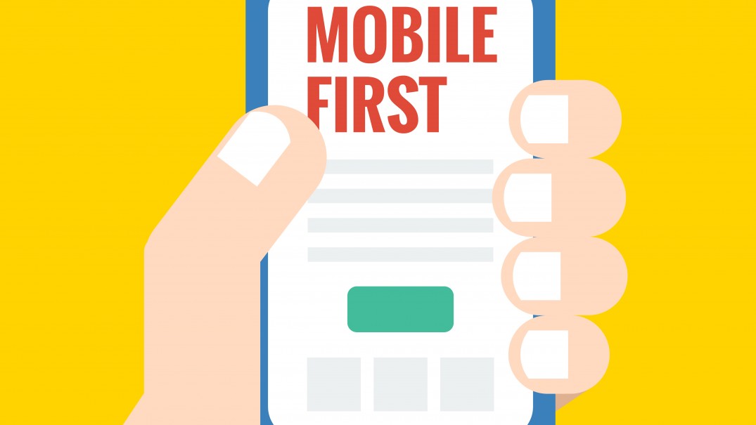
In the context of the Mobile First Strategy, which has been preached for years but still often neglected, it seems more questionable whether a change to Mobile Only will begin this year. In addition, you have to ask how many users actually have a mobile-only approach. After all, not a few of us switch back and forth several times a day between desktop, smartphone and tablet.
On the other hand, Buckler's forecast on mobile devices is not alone. Also elsewhere, it is said that this year, at least mobile will first experience an upsurge in web design. To this extent, this forecast doesn’t appear to be quite far to come true.
Forecast 2: Clear Design = Material Design?
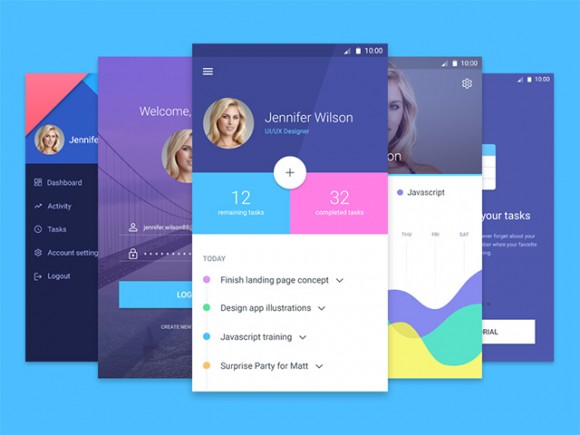
In the App area, the standards of material design have already been well accepted; if only we all design for it in the future, the material design could also be booming. In fact, this seems to be a perfectly plausible forecast when one looks at different predictions for the year 2017.
The concept "material design" is not used in most cases, but it is a principle of design style and reflected in the web design trend. Website design with overlapping layers, strong shadows and contrasting, strong colors are again and again predicted as a major trend in early years. In this respect, working for material design could be worthwhile.
Forcast 3. Widespread utilization of rapid prototyping tools
Rapid prototyping tools are definitely one of the most useful breakthroughs to hit the web-design world over years and become a must tool for UI and UX designers.
Rapid prototyping tools, such as UXpin, Mockplus and InVision all allow designers to quickly make low to high fidelity prototypes to test their usability, without writing a single line of code.
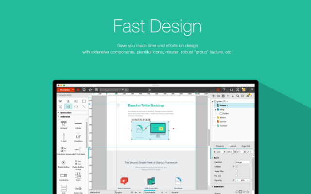
The days of showing client static wire-frames and mockups are gone, rapid prototyping tools can explain in detail with every subtle animation and transition included. Customers only need to see how it works and looks, without any long, complicated conversations about user experience or transition speeds.
Read more:
Comments
Post a Comment