We see a variety of web form design almost every day for logging in or give information to acquire service or publish content. However, the process of filling out forms is often not so pleasant. We spend the time to enter information, click submission and then we may have to wait for an audit. Especially for relatively complex and long process forms, the poor user experience is easy to frustrate users and make them end up giving up.
How to improve the efficiency of filling out forms and prevent users from mistakes or lost half way? This article sums up the following methods:
1. Convincing users to fill out effectively:
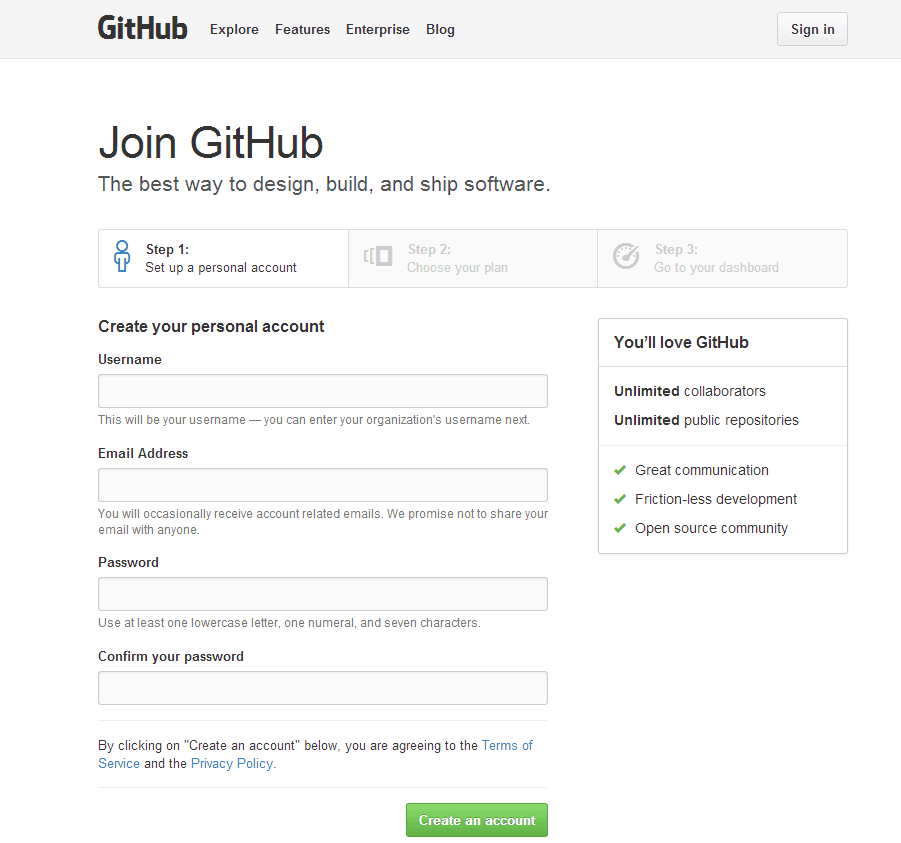
First, build great forms to tell users the reason to fill them out. What can they get? Let users see the benefits of giving you the information. For example, Github tells you clearly what kind of help will you get on the right side of its registration web form design.
In addition, you can be more specific to tell users your consideration of letting them fill out a particular information form.
To convince users to fill out the form effectively, you also need to remove the negative interference to gain their trust. In most cases, the biggest concern is the use of information after the site collect them. Users do not want their privacy made public or continue to receive spam sales emails. At this point, you can cite some authorities as evidence, such as media reports and user cases.

You can do it in a more considerate and intimate way like informing users the estimated time of filling out the form they may consume.

2. Organizing the information reasonably
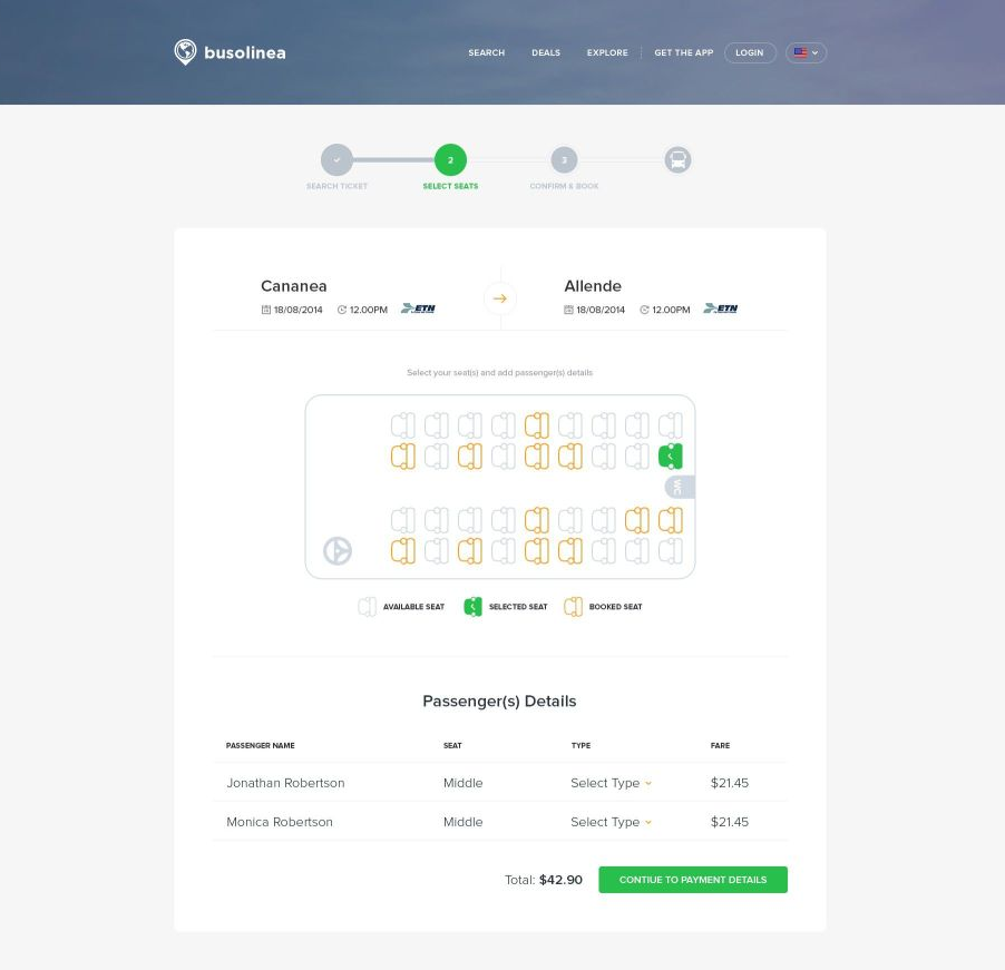
For more complex web form designs with more items, if the information is not organized well, it is very likely to appear complicated and chaotic. Users are easy to get a sense of resistance or even just give up in the beginning. Reasonable and stratified information organizing means the difference of frames, spaces, and color. Sections shall be well-divided by different categories, features, and dependency. The current process shall be indicated by steps.
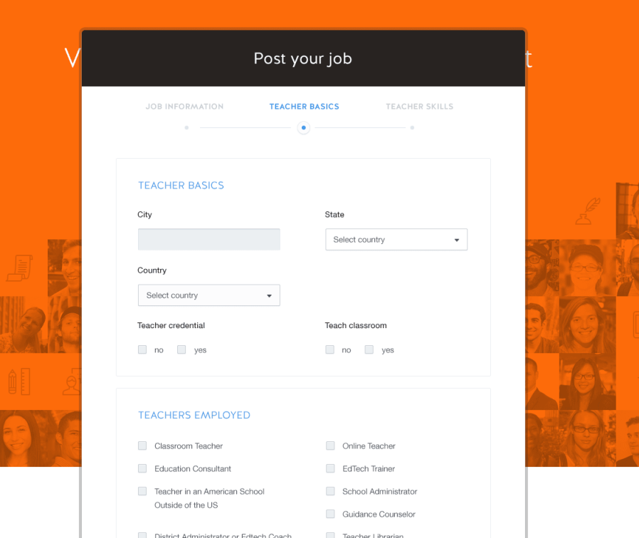
In general, blue means informing, yellow means warning, red means error and green means success.

Clear browsing lines, reasonable labels, tips text and button layout can avoid the appearance of repeated information and reduce the users’ visual burden and physical burden.
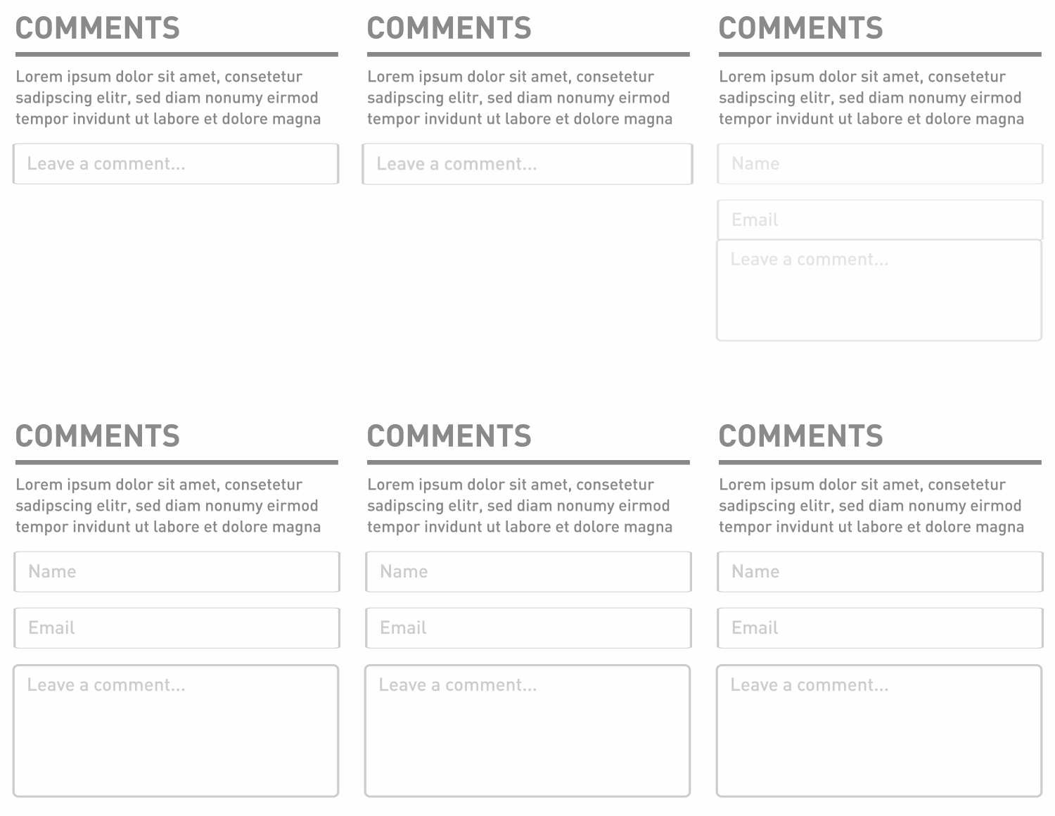
Hiding information appropriately can make the whole web form design look more refreshing and pleasant. Some information can be set in the need for related operations when it appears. It is important to distinguish between primary and secondary actions. Use buttons to define the primary actions while links to the secondaries. Remember to add more obvious style to the primary actions than the secondaries.
3. Saving time for users.
Spending a lot of time to fill out a form drives people crazy. When you are making a web form design, you should assume that all users are lazy and busy. Try to delete all unnecessary file items and consider whether there are better ways (such as follow-up design research) to collect information than making users input mechanically through the keyboard.
The verification code is always a pain-in-the-ass item in a form. Users need to wait for the verification code to be generated, confirm the contents of it, make sure it is entered in order to click on the submission, and the whole process is nothing about users’ benefits. Users won’t be awarded for filling out one more verification code. We can change the experience of entering the verification code to make it more simple and fun, or through the new background logic to limit the number of daily users to cancel the verification code.
Colleagues from an anti-malicious group of our security platform have created an ingenious form of picture verification code.
Except for the verification code, the second confirmation password existed in the registration confirmation form is also time-consuming. At present, many foreign mainstream sites, such as Facebook, Twitter, LinkedIn, Friendster, etc. do not require users to confirm the password when filling out the registration form. WordPress even send ready-made password directly to the users’ mailbox rather than ask them to fill out a form.
In addition to the above ways, plaintext in the first time users enters the password also helps when they do it again. For information security considerations, dark text switch should also be provided for users who need it. The following is my collection of plaintext password confirmation methods for your reference:
Mouse click-and-drag operation is more efficient than a keyboard. Add pickers, shortcut options, smart associations, range slider, number micro-tuning, etc. so that users can complete the form more quickly.
Add picker, shortcut options
Support drag-and-drop upload:

Smart association:

Range slider
Micro-tuning
The drop-down box should be used with caution since it will hide information from users. It is better placed in date/province choosing the section or anywhere has a larger range of options. For a range-limited and important options, it is more appropriate to use more obvious choosing methods.
Reduce the input requirements including format, case and so on. Make your system more flexible than letting users change their typing habits for you.
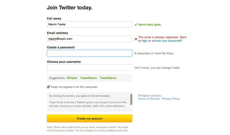
Prevent errors. Verify the information instantly so that users can modify the information. Moreover, we can also restrict users’ behavior (such as the arrival date cannot be earlier than the departure date )or provide automatic correction to prevent users from making mistakes.
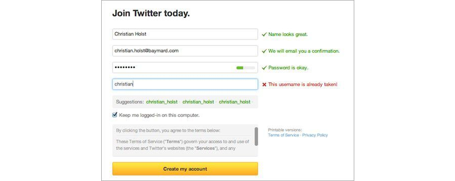
By providing more active interactive feedback, present text, automatic access to information, automatic format changes, fill the decimal point, etc., so that your form becomes more friendly.
When the user enters the credit card number, it should automatically determine what kind of credit card the user use.


When a phone number is entered wrong, users are more likely to find out if the belonging location doesn’t match.
4. Providing friendly guidance.
Clean up obscure technical terms (such as database errors), try to use a more intimate language to guide users to fill out the form, tell users the cause of any error. When the problem occurs, clearly explain the reasons for the problem and provide an effective solution. If necessary, you can also add more vivid photos or visual graphics besides guidance text as a guide.
5. One package service

Being submitted is not the end of a form, we should provide users with one package service to form a closed-loop and avoid users’ jumping out in the middle of the service. For example, a user is told with insufficient balance in the payment process, the user can only recharge to continue the follow-up operation. But when it’s all done, the user finds that the original page with payment and goods is gone. This is a typical example of being not closed-loop. The same story happens in the download websites. Users are often told to sign up before downloading. However, when you finish the sign-up process, the page will automatically jump to the home page of the forum.
A good web form design, not only need to consider the pre-filling guidance and the in-filling help, but also need to consider the experience after the whole process. Thinking about what the original intention of the user and let him get what he wants most after the filling. Even if he is temporarily unable to get it, we also need to tell him the corresponding reason and alternative operations.
6. Providing design care
According to statistics, about 12% of the population has a light or heavy color vision disorder. If you use color as a unique element that distinguishes between non-clickable text and clickable links, it may make this part of the person difficult to use. We can add a dotted line to the link text, use a button or other shape to distinguish so that these users can more clearly know which is clickable.
Author: 把我给崩了
Translator: Devin
Original site: http://www.3lian.com/edu/2014/11-27/181352.html
Orignal link: http://www.3lian.com/edu/2014/11-27/181352.html
Comments
Post a Comment