You may wonder what design patterns are? Well, they are various in form and widely applied in design practice. To use web app design patterns is an irresistible trend and a compulsory course in UX design 2017. With the popularity of smartphones and the development of new technologies, users’ expectations have become higher than ever and it’s not that easy to make a good design with design patterns.
Below we’ll explain why and how to use design patterns, focusing on the best web app design patterns and principles involved. Hopefully, it could give you a new way of thinking when designing web applications.
What Are Design Patterns?
In short, design patterns are a collection of interface elements that are familiar to users and reusable in many design problems. It should be implementable and easy-to-use to make it well-accepted. A good design pattern can help make your design better without extra efforts, while a bad design pattern can even discourage users and push them to your competitor.
Generally, there are 3 kinds of design patterns, including structural, creational and behavioral patterns. Though in different forms, the 3 basic patterns share some characteristics in common, and the key design points of them lie in:
1. The color match
2. Utilization of space
3. Compatible with different screen sizes
4. Adopt progressive presentation
Common Web Application Design Patterns
1. Navigation Design Patter
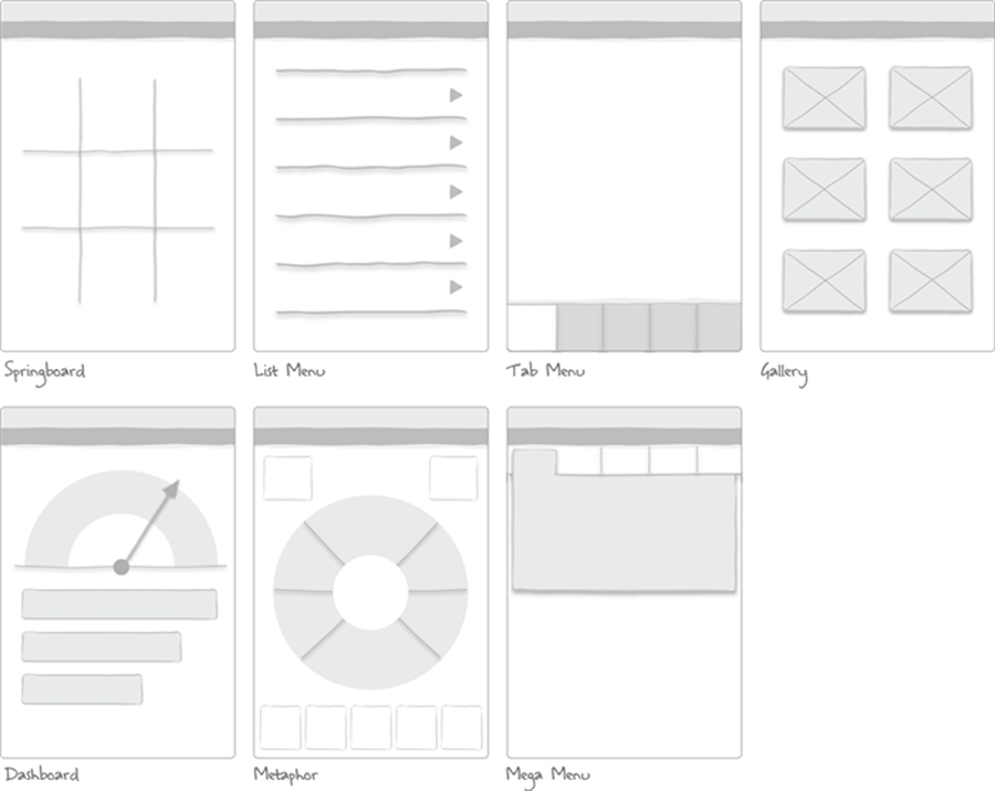
Not only is navigation used in mobile UX design, but plays a crucial role in improving the user experience of web app. The commonly-used navigation design methods include label navigation, rudder navigation, drawer navigation, integrated navigation, list navigation, carousel navigation and so on.
2. Form Design Pattern
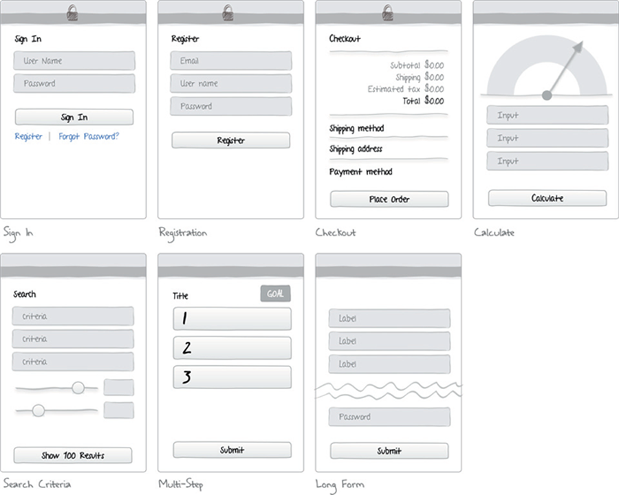
This kind of pattern is not difficult to realize in developing, while it’s totally different from the point of the design. It should not only include beautiful visual effects and coding pattern, but also guide users with minimal text. The common forms of web app design are:
1) Login Form, is to input authentication credentials in order to enter a restricted form or page.
2) Registration Form, is to fill in data within a list of fields and then submit to an organization/individual.
3) Search Form, is different from other forms as it doesn’t deal with many attributes.
4) Multi-Step Form, is such a form that starts on one page and continues on another page.
5) Long Form, is variously defined and can help to engage readers with a rewarding experience.
3. Table and List Design Patterns
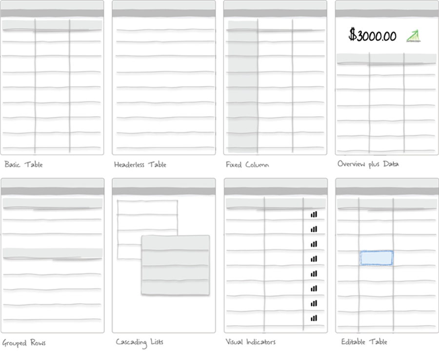
As another kind of web based application design pattern, tables and lists can present content to users in an overview manner. Henceforth, the core of them is to highlight the most important information so that users can easily locate what needed.
4. Search, Classification and Filtering Design Patterns
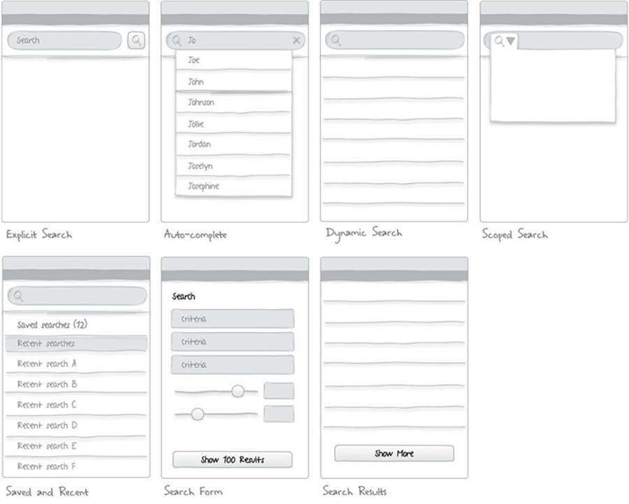
The core part of those design patterns is the usability. Those design patterns can be good and useful for users only if they are easy-to-use.
5. Graphic Design Pattern
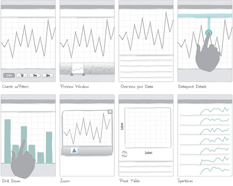
There’s lots of information coming to us every day, which contains a number of charts and data altogether. Undoubtedly, complicated and old-fashioned content can make users feel bored and tangly. However, designers can still learn from the basic design concept in those content and make the data acceptable in an easy-to-understand way.
Final Verdict
Obviously, the web app design patterns have been attached more and more importance and attention for its profound and lasting effect on user experience and web conversion. Other than the above-mentioned design theories, I do believe that a “good” design tool can help you achieve maximum results with little effort. If you’re looking for a tool with a good balance of usability and functionality, then you cannot miss out Mockplus.
Comments
Post a Comment