Website carousel, an interactive way, seems to be commonplace in the web era. When a group of people is competing for the priority of the focus picture on the homepage, it seems that using carousels can solve this dispute effortlessly and hence no one loses. However, is this really an effective way? How to design to give users a better experience?
You should take carousel usability into consideration. In fact, the click-through rate and conversion rate of a website carousel are usually low. However, it occupies the vast eye-catching place on the page. Imagine such a scene: when you go to the library to find a specific book to read, a salesman stays in front of you and asks you to look at a large advertising map first; however, he switches to another advertising map before you finish reading the contents on the first one. He is annoying, isn’t he? So it is in most of the design of carousels.
1. Make sure you really need to use a carousel
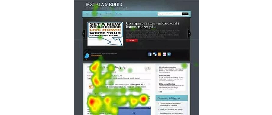
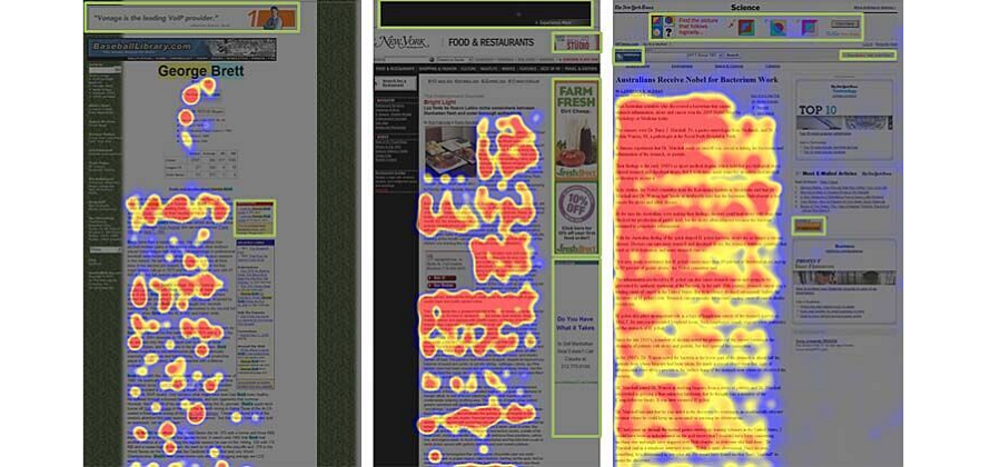
First, an improperly designed carousel tends to be disregarded by the user as an ad image that is not relevant to the content he wants to view. The users who are sufficiently experienced in a variety of web pages will choose the quickest way to find and browse the content they want to see. To focus on looking at unexpected carousels is obviously inefficient because it results in a blind spot that jumps into users’ view automatically. Following is a thermodynamic diagram that shows users’ browsing habits: quickly scan to find the place they want to read, and then immersively read in order. They all unexceptionally ignore the images that seem to be advertisements.
In addition, the results of the study in 2013 show that the interaction effect of carousels is very unsatisfactory: only 1% of users click on toggle buttons of the carousels, 84% of which click only one time on the homepage.
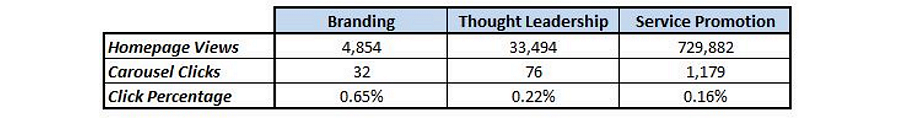
Besides, according to the research and analysis of more than 30 B2B websites by several scholars, carousels are divided into three categories based on the content: branding, thought leadership, service promotion. It’s found that the click rates of all the three categories are very low (0.16% ~ 0.65%):
Not only that, there are following problems in many sites which use carousels:
Using complex large pictures. Because a carousel generally carries a lot of picture messages, complex large pictures result in low performance and slow loading rate of the sites, especially those whose first homepages are occupied by high-resolution carousels. Such huge picture information can have a vital negative effect on loading rate. One more second in loading means losing of users. Both users and search engines give preference to the sites with high loading rates.
Using rotated titles. Many developers tend to have the <h1> tag on the carousels on the top of the page so that there are 4 to 5 different <h1> tags rotating on the page, resulting in decreased retrieval ability of related keywords.
Using Flash. Some of the sites’ carousels use Flash to show the content, which can yield cool results but can not be crawled by any search engine.
2.Carousel alternatives
In summary, an improperly designed website carousel is easy to be ignored, and its click rate is usually not ideal. What’s more, it can also have a negative impact on SEO. Therefore, we should not use carousels indiscreetly before contemplating the priority and expected effects of the content that we want to deliver to users. Actually, there are many other ways to help us solve problems and bring good effects:
A. Find out the content that most needs to be conveyed to users, and put the secondary content in the secondary position.
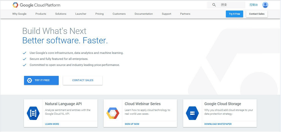
There are a wide range of products and services on Google Cloud, but this site doesn't use carousels to display all of its products and features. In contrast, it clearly shows its condensed brand value and concept to users and provides both primary (free trial) and secondary (contact with salesman) conversion entries which are put in prominent places. At the same time, the other secondary entries are located at the bottom, offering users a choice to platform products and services a wide range, but did not use the rotation show all the products and features, but the concentration of the brand value and concept clearly displayed in front of the user, and provide the main, times (and Sales staff contact) two obvious conversion entry. At the same time, the other secondary entrance can be put in the bottom so that users can choose to click away through the top navigate bar or continue to browse down, so as to quickly find the content he/she’s interested in, as shown in the picture below:
B. Make it a part of the content.
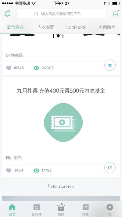
Oxygen is an app focusing on underwear purchasing recommendation. When you scroll through the products on its pages, the promotion information will be shown to you in the usual way of product recommendation, generating a light sense of disturbing and a high conversion rate from users in immersive reading, as shown in the picture below:
C. Remove unimportant promotion maps, and display the content directly.
The picture on the right seems to be"nicer" and more "attractive", but in the actual scene, the user always habitually ignores the content on the banners and selectively read the text. Display directly what the user needs can improve users’ retrieval efficiency and hence generate a higher conversion rate:
So, when your partner tells you that he wants to "add a banner which can rotate", do not rush to start drawing but follow the following steps to have a discussion with him/her:
A. Think about: what is the purpose of doing so; what content you most hope that the user is concerned about when he/she opens the page; whether those content can be prioritized.
B. Rationally understand the effects of carousels according to the existing research conclusions. That is, a carousel is not a panacea and can bring negative effects when improperly designed.
C. Thinking about whether there is a better way to achieve the same purpose and get the same effect.
D. When it’s hard to make a choice, do AB test.
3.Where a carousel should be used
Now you may also have these doubts: is really a website carousel hard and inefficient to use? Why are so many websites still using it? Why are my website data different with the data mentioned above? The above data is based on the web scene, and will it be any different in the mobile scene?
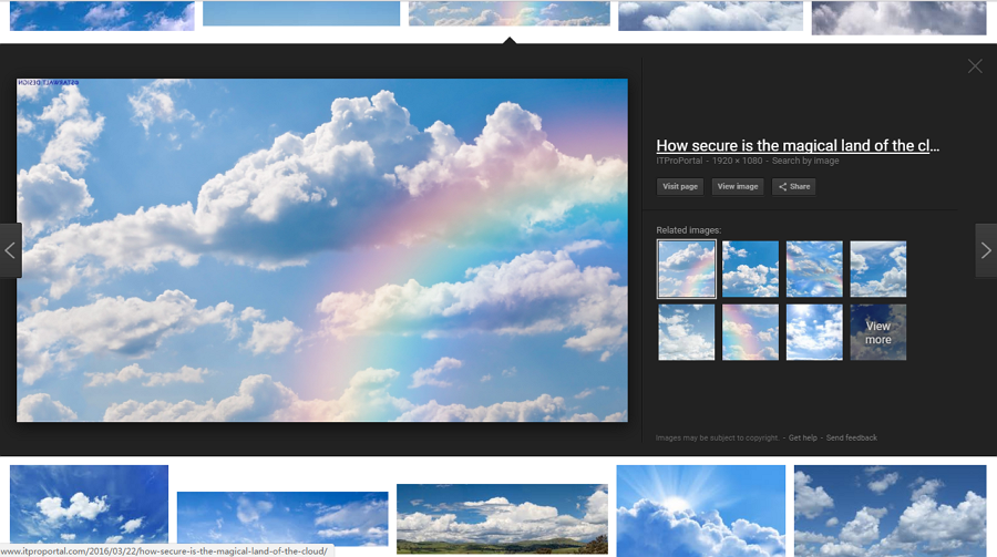
It is true that some scenes are very suitable for carousels - when it is most efficient to convey the information users want to view in the form of a picture, all the pictures belong to the same category and users has expected it. Google image is a typical example: when searching the keywords of a picture, he/she will firstly see the small picture list; clicking one of the small pictures to see the original picture, he/she can read more similar pictures through left&right arrows or related picture recommendation.
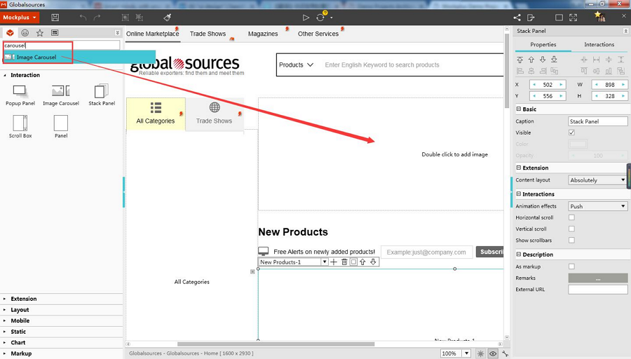
Inaddition, it can also be applied to other scenes when a site simply shows pictures or rent its ad spaces. Before using carousels, you can use Mockplus, an effective tool to make prototypes and interactive design, to do prototype usability tests and simulations.
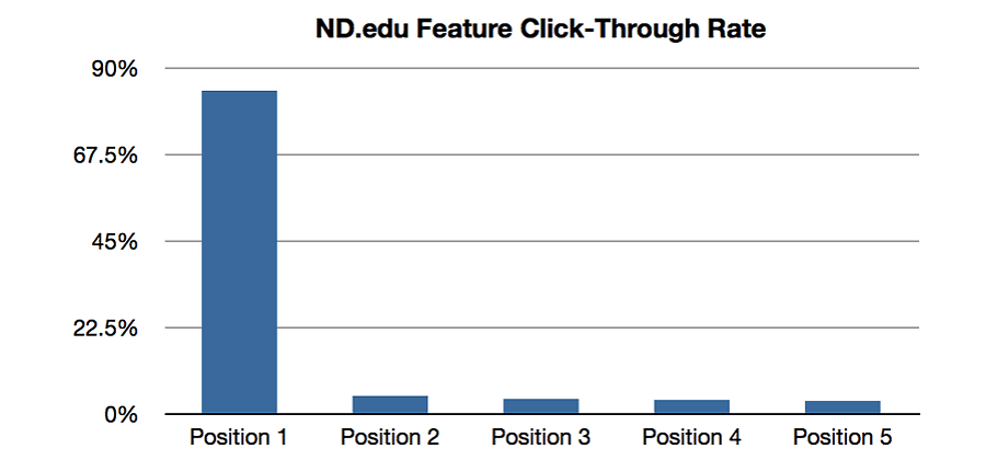
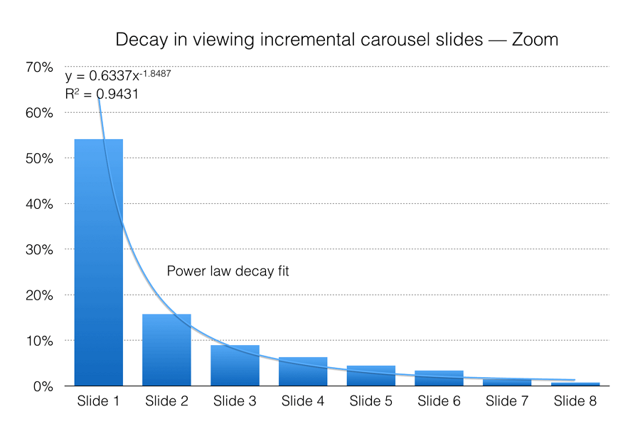
In addition, in the mobile scene, the vertical height of the screen is smaller, the proportion of the carousel is larger, and its interaction operation has a larger trigger area than that of the web scene, so it has a higher click rate. Some scholars made a research and analysis on the interaction effect of the carousels of mobile e-commerce websites. Thier results are different with those of Erik: 23% of the users clicked the content of the carousels, 54.1% of which finished conversion on the first page, and 15.7% of which operated on the second page. Although the data line is also linear-decreasing, both the click rate of the carousels (23%) and the click rate after homepage (45.9%) are higher than the data that Erik previously got on ND.edu.
Summery
Due to different historical backgrounds, user habits, concerns and designing schemes of different sites, the data may vary widely. What we need to know is that to use a website carousel or not is not crucial in influencing the click rate and conversion rate of a site, but the key lies in whether there is a designing scheme suitable for the actual scene. In the appropriate scene, carousels with good user experience can also bring amazing effects.
Read More:
Author: Jana
Translator: Chloe
Original websites: ISUX
Original link: https://isux.tencent.com/carousels.html
Comments
Post a Comment