- Apple is not perfect and also has some deficiencies in its design. Following are several design mistakes in iOS app UI design during its process of version updates. These contents only represent my personal view. Please feel free to discuss if there is any different opinion.1. The notification centers of iOS7 and iOS8 follow first the inverted order of notification receiving time and second the order of app classification, greatly decreasing users’ efficiency of notification processing.
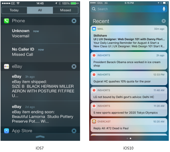 In the notification centers of iOS9 and iOS10, the previous complex classification of the notifications (first the inverted order of notification receiving time and second the order of app classification) is changed to the integration of time as a whole, increasing the efficiency of notification processing. I guess everyone should have been tortured by this design mistake before using iOS9: click close buttons one by one to clear all the notifications.In this information-overloaded age, everyone now has so many Apps on his/her phone and may receive countless unwanted notifications. Useless notifications are much more than useful notifications, so users usually just glance at most notifications and then delete them all. Now Apple has changed to arrange in the integration of time as a whole, greatly improving the efficiency of processing. So many clicks need to be done that the efficiency is greatly reduced.But actually, it’s not enough. Incapability to block notifications easily is another irritation of users. Users should be allowed to block and thus never receive the notifications from a certain application.2. In iOS9, filter, rather than camera switch which is more frequently used, is placed on the easy-to-operate interface area below the interface.
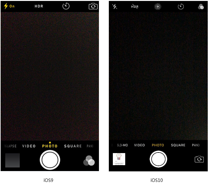 On the camera interface of iOS10, this design mistake in iOS icon design is corrected and the location of filter is exchanged with that of camera switch. The reason for the exchange is obvious that functions which are most frequently used should be placed in conspicuous and easy-to-operation positions.Camera switch which is more frequently used should be put in the lower place of camera interface, because when users are holding a phone to take a picture, the bottom of the screen area is a most convenient location to click, whether the phone is vertical or horizontal. Moreover, according to our habits of picture-taking, especially for girls, the click rate of camera switch icon is much higher than that of filter icon.3. The quick notification viewing operation in the lock screens of the versions before iOS7 is obscure.
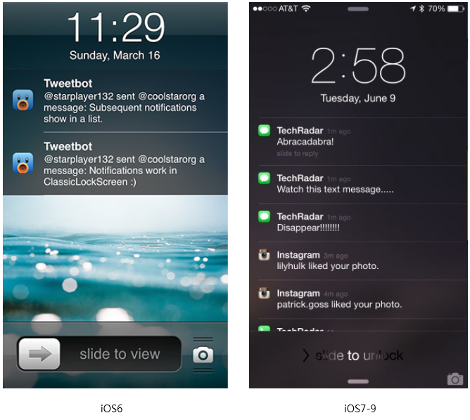 Here are some basic principles of interaction design:Ability to be predicted before operationAbility to give feedback during operationAbility to be undone after operationHere I recommend a good prototyping tool to do interaction design: Mockplus. The interaction design in Mockplus is totally visible, that is, WYSIWYG. With a simple drag-and-drop an interactive prototype can be built effortlessly. A set of pre-designed components, including pop-up panel, stack panel, scroll box, sliding drawer and image carousel, allow you to create fully interactions faster and easier.In the left-hand picture, from the perspective of the ability to be predicted before the operation, there is only a right-slide-to-unlock operation guide suggestion, but no notification of right sliding and the operation guide suggestion of quick unlocking and hence entering into the notifying app. It results in the low usability of the interface. Users hence may not know how to quickly check notifications; however, to quickly check their notifications is the main operation for users after receiving notifications. I remember that a colleague told me: ”have a try to slide right, and you can unlock it and check the notifications.” I believe that many people that time should be the same with me, and did not know the lock screen can be operated like this.In the unlock screen of the right picture, there is a slide-to-view text prompt in the vicinity of a recent notification, suggesting the slide on the notification to view. Therefore, there is no problem in its usability design.4. In the call logs of iOS9 and the previous versions, if a contact has multiple numbers, the dialed numbers of a call log are not clear.
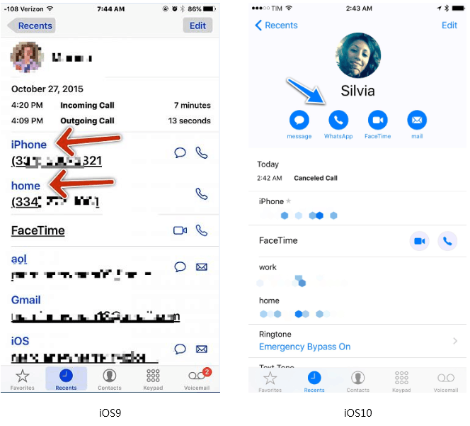 In the call logs of iOS9 and the previous versions, the dialed numbers of a call log are simply marked in blue. If a contact in the call log has multiple numbers, the dialed number corresponding to the call log can’t be intuitively recognized.A [recent] identification tag is added to the corresponding dialed numbers in the call log of IOS10, making it clearer for users to see which number he/she should call back.5. The control center of iOS7 is more like an interaction draft without any design, and the division among different functional areas is not clear.
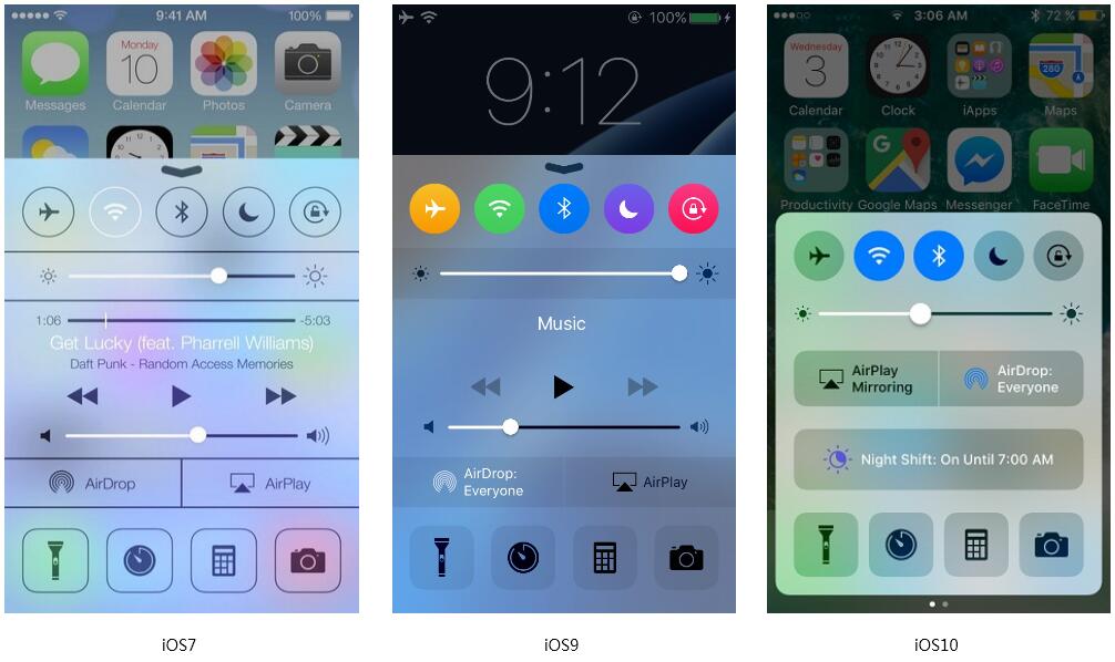 According to the Gestalt theory, the way to categorize information is usually to use spacing, split lines, background colors to distinguish different information. Let’s compare the control center of iOS7 with those of iOS9 and iOS10. You may find that the control center of iOS7 is more like an interaction draft without any design. In the small multi-functional user scenario, iOS7 control center distinguishes different functional areas simply by several dividing lines, making the interface too messy and the operable interface ambiguous. Hence it's an obvious design error. By contrast, iOS9 and iOS10 distinguish different functional areas by different background colors, making the information presented more clearly.6. The functions blow iOS sharing menu gives us the feeling that they are not clickable.
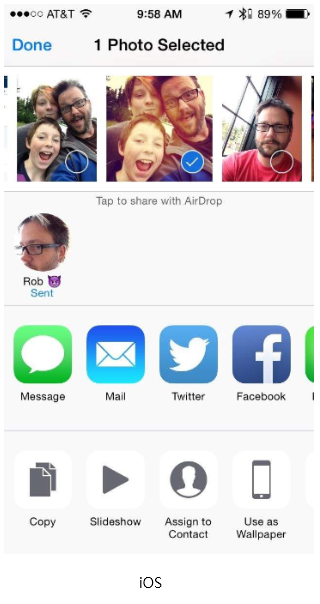 The row of function icons below is visually distinct from the row of app icons above, delivering a feeling that the function icons are not clickable and the functions are not usable. Hence it's also a mistake Apple makes.7. In the application-delete confirmation dialog box of iOS7, the [delete] button is put in the unreasonable position. The original intention is good, but the design is excessive.
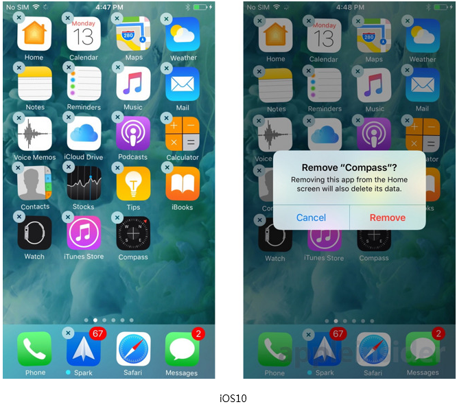 In the application-delete confirmation dialog box of iOS10, the [delete] button is moved from the left side to the right side, and the original blue bold font is changed to the red bold font, enhancing the visual cues of the delete operation.The general principle of the operation buttons of iOS dialog boxes is: the main operation on the right, the cancel operation on the left. And its application-delete confirmation dialog boxes have always applied reverse design, that is, [delete] on the left, [cancel] on the right. Now this change proves that their previous reverse design is a design mistake. There is a very high threshold for a user to implement delete operation: hold down the icon; when the icon jitters, accurately click the cross to delete (which placed in the upper left corner, a hard-to-click place); then the deletion dialog box appears. This series of operations are sufficient to ensure that the users don’t make wrong operations, so there is no need to design other obstacles so as to prevent the misoperation.SummeryDesign is not art. It is not isolated. It’s not the designer's self-entertainment. Design is always associated with people, usage scenarios and user needs. To make its design in line with the current trend, iOS should continue to update its design, make up its design mistakes and make changes based on the changes of the time (people, environment, needs), in addition to its commercial consideration.Read More:Author: Xian ShiTranslator: ChloeOriginal websites: ISUXOriginal link: http://isux.tencent.com/mistakes-of-apple-design.html
If you compare mobile app to a human, the homepage would be the face. The homepage is the area that people notice at the first glance and decide their basic judgments about your mobile app. The mobile app homepage design is the door to a successful product, and a good start is half the battle. Since 26 percent of mobile apps are used just once, the first impression is essential to tell your customers that you are worthwhile being used for a long time. If you can’t please the eyes of critical users on the homepage and provide a good user experience, your mobile app has already failed. Therefore, if you want to create a good user experience design on the app homepage and draw the users’ attention, you need to answer these questions: Question 1: Who are you? Users firstly see the interface, and then the content. At this stage, a good design, which is in line with the brand and has a rich content, will give your users a deep impression. Every mobile homepage needs a...
Comments
Post a Comment